VoM #2 – OECD Better Life Index
How’s life? Measuring Well-Being. OECD Better Life Index visualization by Moritz Stefaner
The question of what constitutes a good life is a fundamental one for all of us. There is no universal answer to it. Rather, everyone seeks to find their individual solution, which is often colored by cultural contexts.
Visualizing well-being on the largest of scales
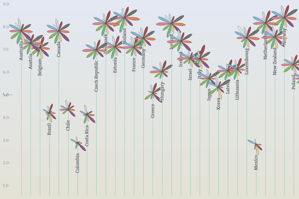
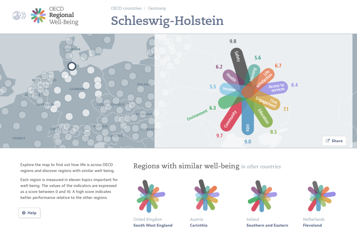
The OECD, the Organisation for Economic Co-operation and Development, has always been deeply involved in the debate on how to measure well-being and quality of life on a large scale. Building on this long experience, it launched the Better Life Index in 2011 as part of the OECD Better Life Initiative. The interactive data visualization shows how more than 30 countries perform on topics such as education, housing or the environment. Users can also set their own priorities. This makes some of the most important aspects that make up a better life visible and comparable.
Each country is represented by a flower, each of the eleven topics by a single petal. Depending on the score a country achieves in one of the topics, the length of the corresponding petal changes. The higher the total score, the higher the flower rises overall.
An invitation to explore and share
This interactive visualization by Moritz Stefaner, a renowned specialist in data visualization, is a good example of combining aesthetics and functional value. The data visualization has become a tool like and playful character. Thus, it encourages users to explore different indicators of well-being and compare their home country with other countries. Finally, the exploration also encourages users to think about what fundamentally constitutes a better life and where these aspects can be found.
The website also invites users to tell others what a better life means to them individually. In this way, it succeeds in getting them emotionally involved in a topic that is of great importance to all of us.
Involvement instead of naked information
From a science communication perspective, what is particularly interesting here is how we can use intelligent visualizations not only to inform people, but also to actively engage them and even involve them directly in the research process. Emotional involvement and thoughtful user experience design are essential factors in creating such experiences.
A visualization with impact
With the Better Life Index, the initiators wanted to convey that “life, of course, consists of more than the cold numbers of GDP and economic statistics.” Thanks to its intuitive design, the visualization has accomplished this task while making a big impact, as its developer, Moritz Stefaner, explains: “Originally launched as a small data visualization project, the website has achieved an extraordinary lifespan. It has been translated into six languages. With over six million visitors and tens of thousands of indexes shared, the project has become a huge success for the OECD and a reference point for other organizations in the field.”
Try it out for yourself now!
To go directly to the interactive visualization, click here.
For more insights into Truth and Beauty operator Moritz Stefaner’s design principles, click here.
About the Visualization of the Month
In our series “Visualization of the Month”, we feature an outstanding visualization on the second Wednesday of each month. One of the criteria for the selection is the extent to which it is aesthetically and emotionally appealing from a design perspective. In addition, we look at the information content. This also includes how the users of the visualization are supported in better comprehending complex contexts. The selection is made within the KielSCN team and involves expertise from the fields of information design, educational science and emotion research, as well as science communication research.