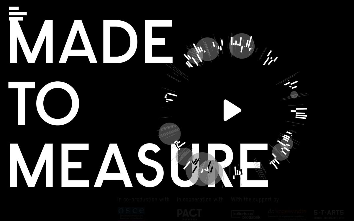
VoM#11 – Made to Measure
reviewed by Anna Vollersen
Data That Tells a Story
Day after day, we give platforms like Facebook and Google insights into our lives, our thoughts and actions – including our most intimate secrets. Using sophisticated algorithms, personality profiles are created from this data in order to target tailored and highly manipulative online advertising. The Laokoon Group’s “Made to Measure” project impressively demonstrates the impact our digital footprint can have. In collaboration with numerous partners and Studio NAND, they created an awe-inspiring interactive storytelling that conveys the importance of privacy in the digital world. We selected the project as our Visualization of the Month in May.
The Data Experiment – Made to Measure
Is it possible to reconstruct the life of a person based only on personal online data without ever having met him or her? The Berlin-based Laokoon group has devoted itself to this question and conducted investigative research. After a Europe-wide call in the summer of 2020, the team, consisting of Hans Block, Moritz Riesewick and Cosima Terrasse, received more than 100 anonymized Google data sets. For their project, they selected data set #25.
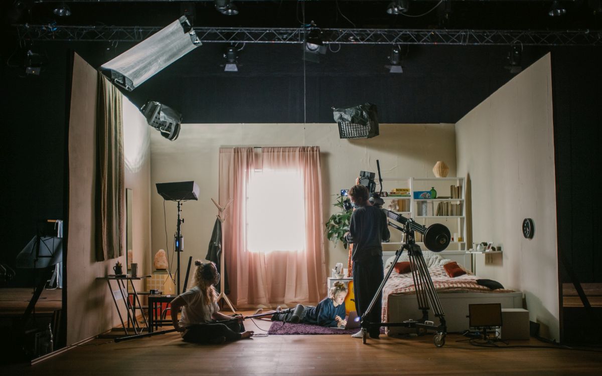
Laocoon then worked closely with researchers at the Stanford Media and Personality Lab to analyze this selected dataset and create a personality profile. With the help of a data analyst and an actress, the team reconstructed five years in the life of the person behind dataset #25 using more than 100,000 data points from the dataset – through a play of several moments in front of different true-to-life settings. In January 2021, the subject and her “doppelganger” created from the dataset finally met. No one had any idea beforehand how emotional this performance could become.
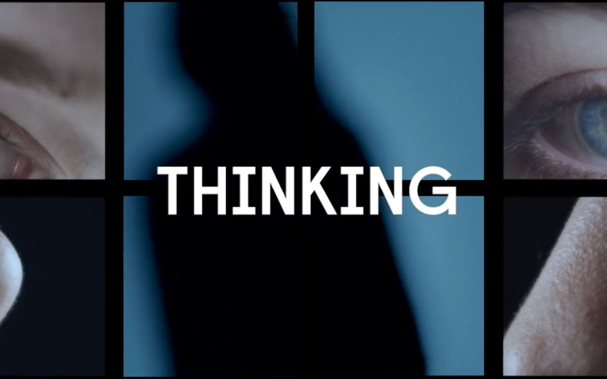
A Transmedial Experience – How do You Interpret This Data?
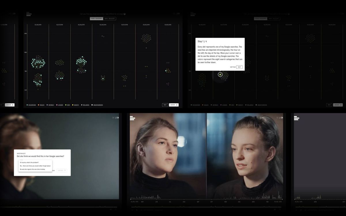
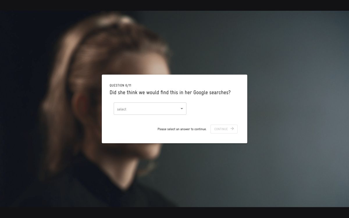
On the first glance, it seems to be a 37-minute video, which reproduces the reconstructed scenes from the subject’s life, her encounter with the “doppelganger” and their dialogues. But I underestimated how compelling the audiovisual narrative is. For example, not only do real-time data visualizations of the subject’s searches support the video. Rather, interactive elements also encouraged me to answer questions and dive into the data sets myself. This actively engaged me in the narrative.
The implementation of the website was carried out by Studio NAND. They developed a video player that enables seamless transitions between video playback and interactive elements. It is also designed to minimize the data footprint of the users, which is a key aspect in the message of the experiment. Thus, they have succeeded in creating a format that integrates the viewers and at the same time makes them want to follow along, analyze and speculate. But that’s not all – they outdid themselves in the end.
Head straight to Made to Measure here to see for yourself.
+++Attention! Spoiler Alert+++
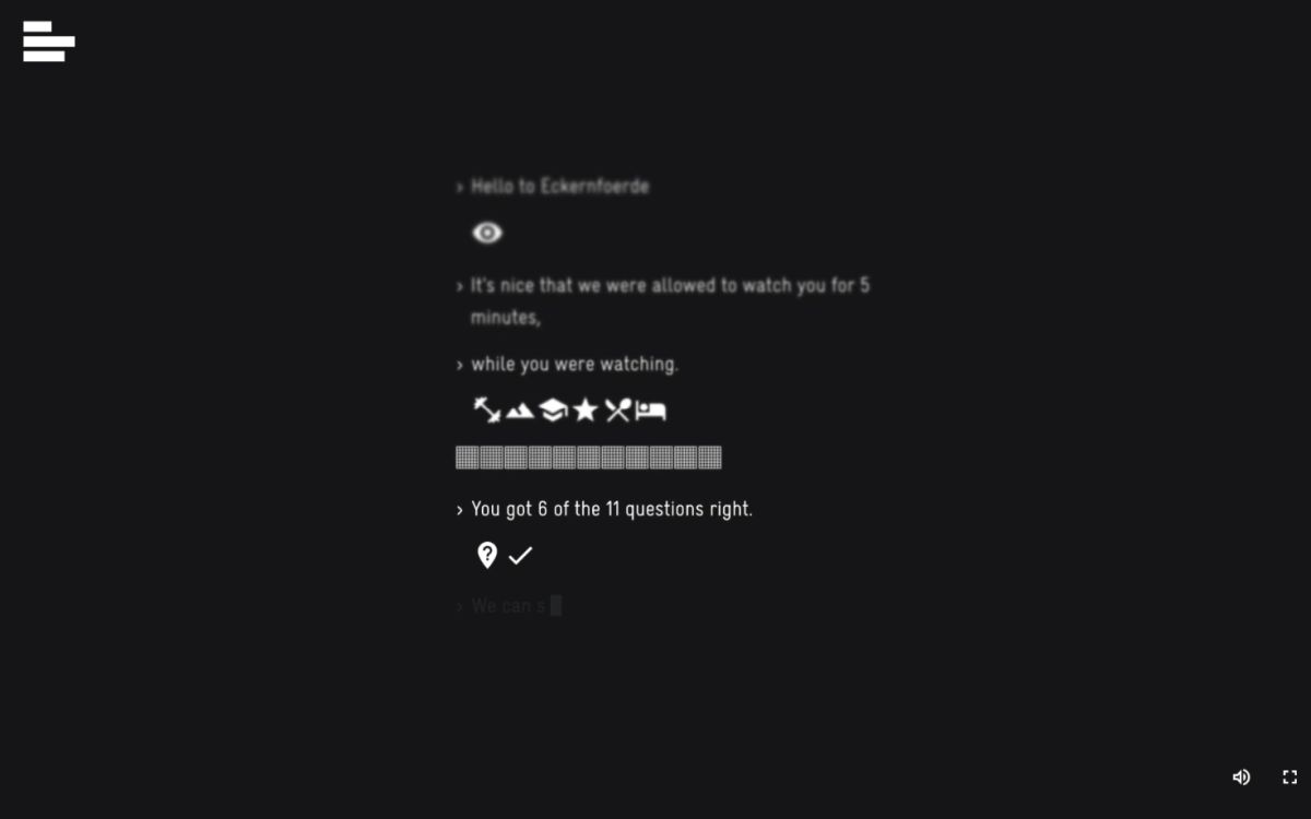
At the climax of the story, the video begins to stutter. The screen flickers and the voices become choppy. It feels like my device is being taken over by an unknown force. I am terrified of what will happen next. Suddenly, the screen goes black and a computer voice speaks to me: it sounds like the subject’s, but it’s her digital clone. The clone greets me and even recognizes the city I am currently in.
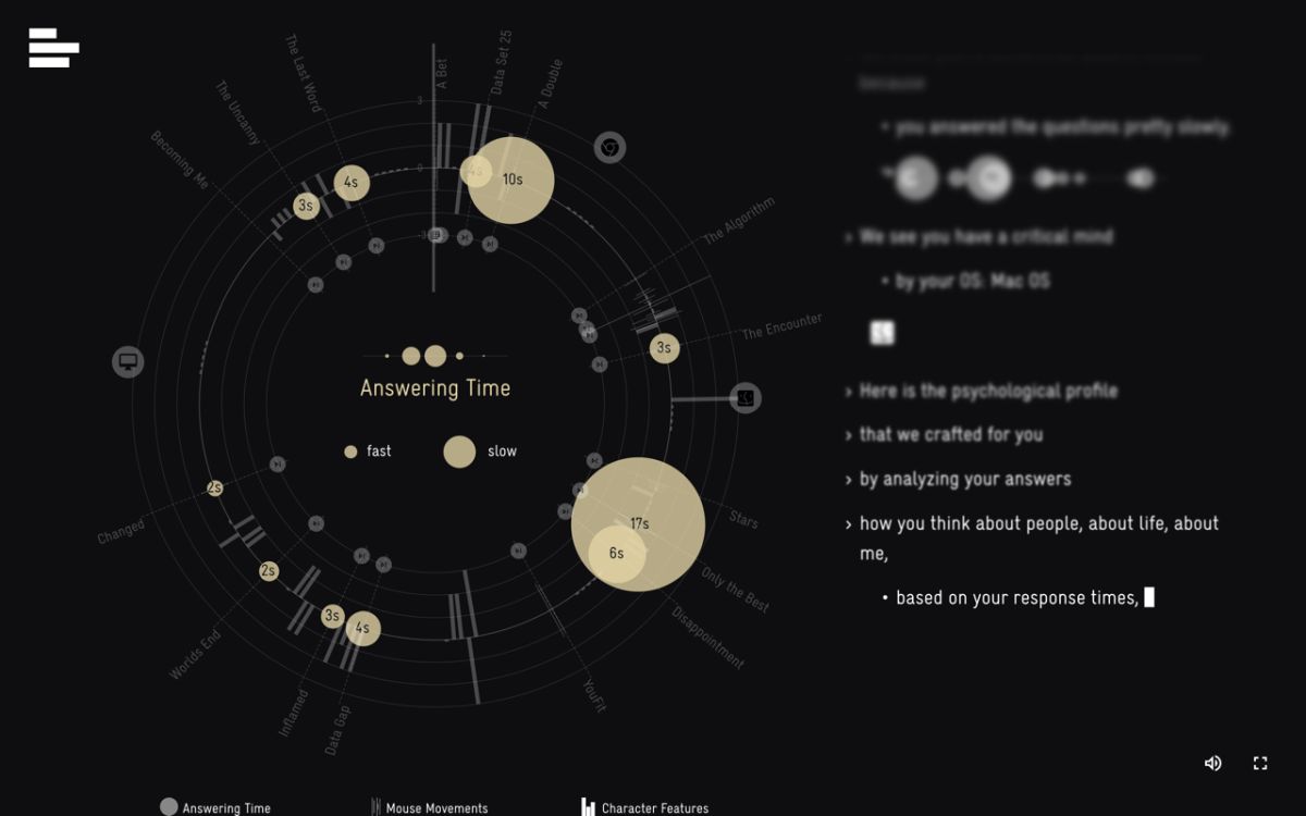
What We Reveal – Analysis of an Artificial Intelligence
What I did not know? That I myself was acting as a data source during my interaction with the website! While I was watching the video, my device profile and behavior were analyzed: How often did I move the mouse? How long did it take me to answer the questions? Did I skip certain scenes or questions? All this data was collected to create a personality profile of me, which the digital clone presents to me at the end.
If the message of the experiment was not yet clear enough, the evaluation by the artificial intelligence should provide awareness now at the latest. A gloomy and threatening mood remains. But it is a brilliant realization of a fascinating experiment, which creates awareness for the handling of personal data and the preservation of privacy in the digital world through strong emotions.
About the Visualization of the Month
In our series “Visualization of the Month”, we feature an outstanding visualization on the second Wednesday of each month. One of the criteria for the selection is the extent to which it is aesthetically and emotionally appealing from a design perspective. In addition, we look at the information content. This also includes how the users of the visualization are supported in better comprehending complex contexts. The selection is made within the KielSCN team and involves expertise from the fields of information design, educational science and emotion research, as well as science communication research.