News,
May 2023
May 2023
VoM#11 – Made to Measure
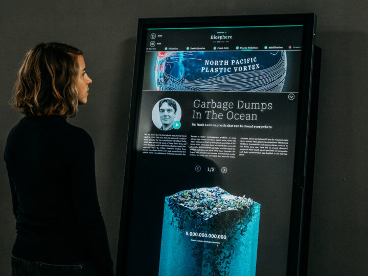
Day after day, we give platforms like Facebook and Google insights into our lives, our thoughts and actions – including our most intimate secrets. The Laokoon Group’s “Made to Measure” project impressively demonstrates the impact our digital footprint can have. We selected it as our Visualization of the Month in May.